First thing they see. Potential clients and customers find your advertisements online or in print. Why trust that critical public presentation to an intern, volunteer, or unqualified employee? Badly designed graphics may not only prevent attention, but actually turn business away. Hire Archetype Multimedia. Eye on the trend, ahead of the game. Your move. |
|
Logo: Sweet Spot Bake Shop It's just psychology... bright colors invoke appetite. By altering the "o" in the upbeat title font, we created a cupcake with repetition of form. Boldy displayed on a black van and business cards, the result is quite an eye catcher! |
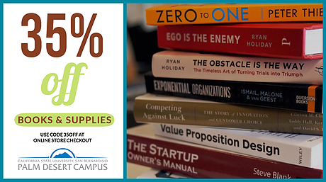 |
Twitter Ad: CSUSB Palm Desert Campus | Book Sale When advertising on social media, the estimated time to capture attention and educate the viewer is less than three seconds. Strong graphics and a photograph that instantly registers, the key to success here. |
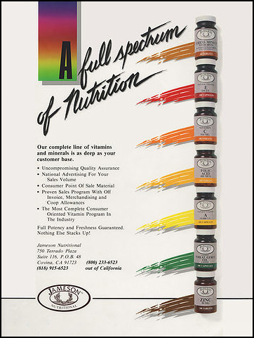 |
Magazine Ad: Jameson Nutritional | A Full Spectrum of Nutrition This wholesaler chose a rainbow color range to identify its variety of supplements, so we reflected that in their industry non-consumer print advertisements. For originality, we employed hand drawn caligraphy rather than a script font for the headline. |
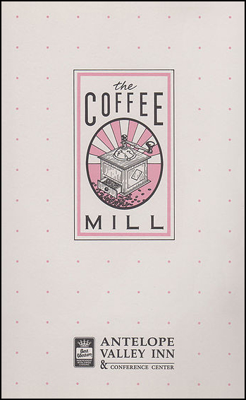 |
Menu & Logo: Coffee Mill One of two new restaurants opening at this boutique resort required a logo and daytime dining menu. Reflecting the old fashioned feel, we illustrated an antique coffee grinder to give it a distinctly different feel from franchise coffee shops. |
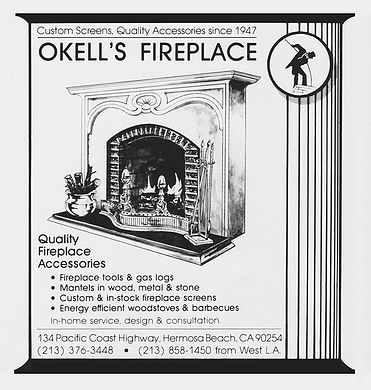 |
Newspaper Ad: Okell's Fireplace A simple advertisement outlining the basic offerings from our high end luxury demographic fireplace retailer and builder. Featuring genuine pen and ink drawing to set it apart from clip art and artificial renderings. |
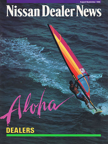 |
Trade Magazine Cover : NDN | Aloha One of our first print projects was to create psychological interest in the annual winter convention for a corporate automobile dealer convention. We bought the cover of this insider magazine and chose a colorful action image, then reflected with bright graphics! |
Logo: Camelot Escrow A very solid sollution for a client who commissioned a corporate image which represented stability, chivalry, and material success. Stationary was embossed with silver foil reminiscent of the legendary metallic castle. |
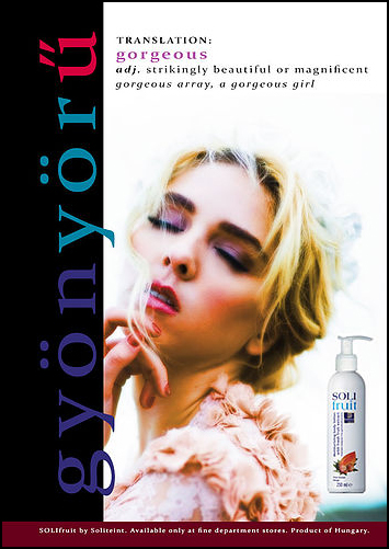 |
Trade Magazine & Web Ad : Solitient | Solifruit For a lovely product sourcing organic herbal and fruit extract ingredients, Archetype selected a fresh model, airbrushed make-up, and seaside photograpy. The graphics reflect a European color scheme for a Hungarian company breaking into a global market. |
Logos: MediCan | Assorted Cannabis Products We gave our client's branding a smart, slightly pharmaceutical (hint of rasta) look to overide the "hippy" legacy of this exploding industry. Each strain has a two word moniker for uniformity, underscored by its product format. |
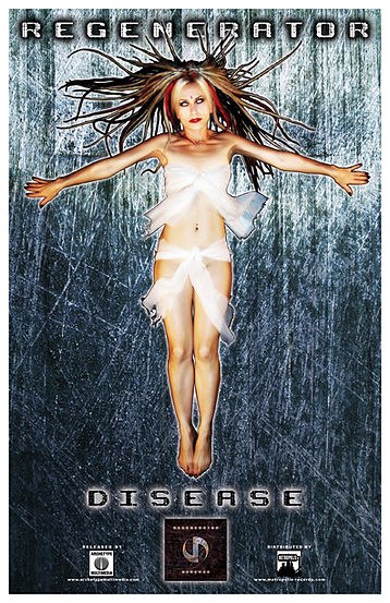 |
Poster & Web Ad: Regenerator | Disease Ahead of the release of a new album by this electronic industrial gothic band, we designed this image for a record store poster, music magazine ad, and social media blitz. Like the cd, the advertising has a sensual and hypnotic yet forboding spirit. |
 |
 |
 |
| VIDEO | DESIGN | AUDIO |
© COPYRIGHT 2021